Wednesday, August 31, 2011

Web Accessibility Wednesday: Form Labels

This is part of a continuing series of web accessibility tips for IT personnel, web managers and web development groups. These tips can be used to review current website accessibility and to utilize in developing new websites with the hope of improving web accessibility for everyone.

Most types of form elements (text boxes, text areas, checkboxes, radio buttons, etc.) have a text label adjacent to them that identifies the function of that particular form element (e.g., "First name" adjacent to a text box). Sighted users make a visual associate between a label and its corresponding form element based on proximity and positioning. A user who is blind cannot make this visual association, so the label must be programmatically associated with its form element using the HTML < label >tag. When properly associated, a screen reader will read the text label when it encounters the form element.


< label for="fname" >First name:< /lable > < input id="fname" >< /label >

Wednesday, August 24, 2011

Web Accessibility Wednesday: Conveying Information Using Color Alone

This is part of a continuing series of web accessibility tips for IT personnel, web managers and web development groups. These tips can be used to review current website accessibility and to utilize in developing new websites with the hope of improving web accessibility for everyone.

Avoid using color or other stylistic differences as the only means of conveying information or meaning. Blind users do not care about the color, font size, or styling of text, so long as the visual aspects of that text are not used to convey content. Screen readers generally do not present stylistic information to the end user. Users with certain types of color deficiencies (color blindness) may not be able to differentiate certain color combinations. Users with low vision may override page colors. Each of these may have difficulty differentiating content based on color alone. The following relies on color to convey information:
The green mushrooms listed here are OK to eat. The red mushrooms will kill you.
Amanita
Chanterelle
Porcini
Shitake
Tylopilus
This can be made accessible by simply creating two lists - one for mushrooms that OK to eat and one for mushrooms that will kill you.

Friday, August 19, 2011

FREE Webinar on Hearing Aids


Choosing the right Hearing Aids: In this free webinar, find out what you need to know about the latest in hearing aid technology and other tips on selecting and paying for hearing aids! Please join the Access Fund on Wednesday, September 14, 2011 at 10:30 a.m. for a webinar featuring guest speaker Dr. Candace Kukino, Director of Audiology for the Hearing Speech and Deafness Center.

Dr. Kukino will discuss recent advancements in hearing aid technology, options and features you need to know about before you buy and steps you can take to ensure that the hearing aids you purchase are the best fit for your needs! Access Fund staff will wrap up with a brief discussion of financing options! Whether you are new to hearing loss, ready to update your aging hearing aids or someone who works with individuals experiencing hearing loss, this Webinar will provide the basic information you need to make the best choices possible when purchasing hearing aids.

For more information, to register, and to request accommodations, please contact Leann Wicklund at leann@washingtonaccessfund.org, by phone at (206) 328-5116 or TTY (888) 494-4775.

Wednesday, August 17, 2011

Web Accessiblity Wednesday: Color Dependency

This is part of a continuing series of web accessibility tips for IT personnel, web managers and web development groups. These tips can be used to review current website accessibility and to utilize in developing new websites with the hope of improving web accessibility for everyone.

Individuals with color-blindness or color deficiency may have difficulty in differentiating between certain color combinations. This affects approximately 7% of males and .1% of females. Difficulty in differentiating red and green is most common - these are most often the colors used to convey meaning or differences. While using appropriate colors, providing good color contrast, and not using color as the only means of conveying content is important for those with color-blindness or color deficiency, these techniques may also improve accessibility to those who are blind (screen readers do not typically identify color) or have low vision (these users may override page colors to make the page more readable). An easy test for color dependency is to print the page on a black and white printer and see if any information is missing when the color is removed from the page.

Wednesday, August 10, 2011

Web Accessiblity Wednesday: Descriptive Link Text

This is part of a continuing series of web accessibility tips for IT personnel, web managers and web development groups. These tips can be used to review current website accessibility and to utilize in developing new websites with the hope of improving web accessibility for everyone.

Screen reader users often navigate a page by reading only the links. The link text (typically blue, underlined text) is read. The function of the link should be available from the link text itself. Ambiguous links, such as "click here", "more", etc. do not provide useful information to these users. The user must navigate or read the link's surrounding context to determine what they link does or where it goes. These ambiguous links should be avoided and can almost always be made clearer.
Example: Change "To perform a search, click here" to "Perform a search".

Wednesday, August 3, 2011

Web Accessibility Wednesday: Captions & Transcripts

This is part of a continuing series of web accessibility tips for IT personnel, web managers and web development groups. These tips can be used to review current website accessibility and to utilize in developing new websites with the hope of improving web accessibility for everyone.

In order for multimedia content to be perceivable to the Deaf and hard-of-hearing, captions and transcripts must be provided. Captions provide a synchronized text presentation of the audio content. Beyond providing basic accessibility to users with auditory disabilities, captions are also useful to other users in noisy or very quiet locations, increase accessibility to those with cognitive or learning disabilities, and provide enhanced comprehension of complex content. They are also helpful when the audio is unclear or in a language that is not well known.
Transcripts provide a static text version of the spoken dialog. Transcripts allow the information to be searchable (by both users and search engines), remove the time-based nature of the content (they can read the transcript at their own pace), and allow the content to be accessible to screen readers and refreshable Braille devices.
Captions and transcripts should be provided for video content and transcripts alone should be provided for audio content (e.g., podcasts).

Tuesday, August 2, 2011

Register by August 10th for the Way Finding Workshop!

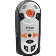
Trekker Breeze by Humanware
The Washington Assistive Technology Act Program (WATAP) will review Way Finding options and how handheld GPS can encourage more confident and independent travel. Discuss whether handheld GPS is right for you and explore the differences between mobile apps or a dedicated device in meeting your needs. Each registered participant will have the opportunity use a provided a Trekker Breeze during a hands-on, outdoor demonstration presented by a HumanWare Product Specialist.

Who Should Attend
Individual consumers who have independent travel skills and interested service providers.

Date, Time and Location
August 24th, 2011
1:00pm – 5:00pm
Greenwood Library Branch, 8016 Greenwood Ave. N, Seattle, WA 98103
Driving directions, bus routes and parking information

To Register
Call 800-214-8731 or email watap@uw.edu

watap logo
humanware logo


This event is not sponsored by the Seattle Public Library